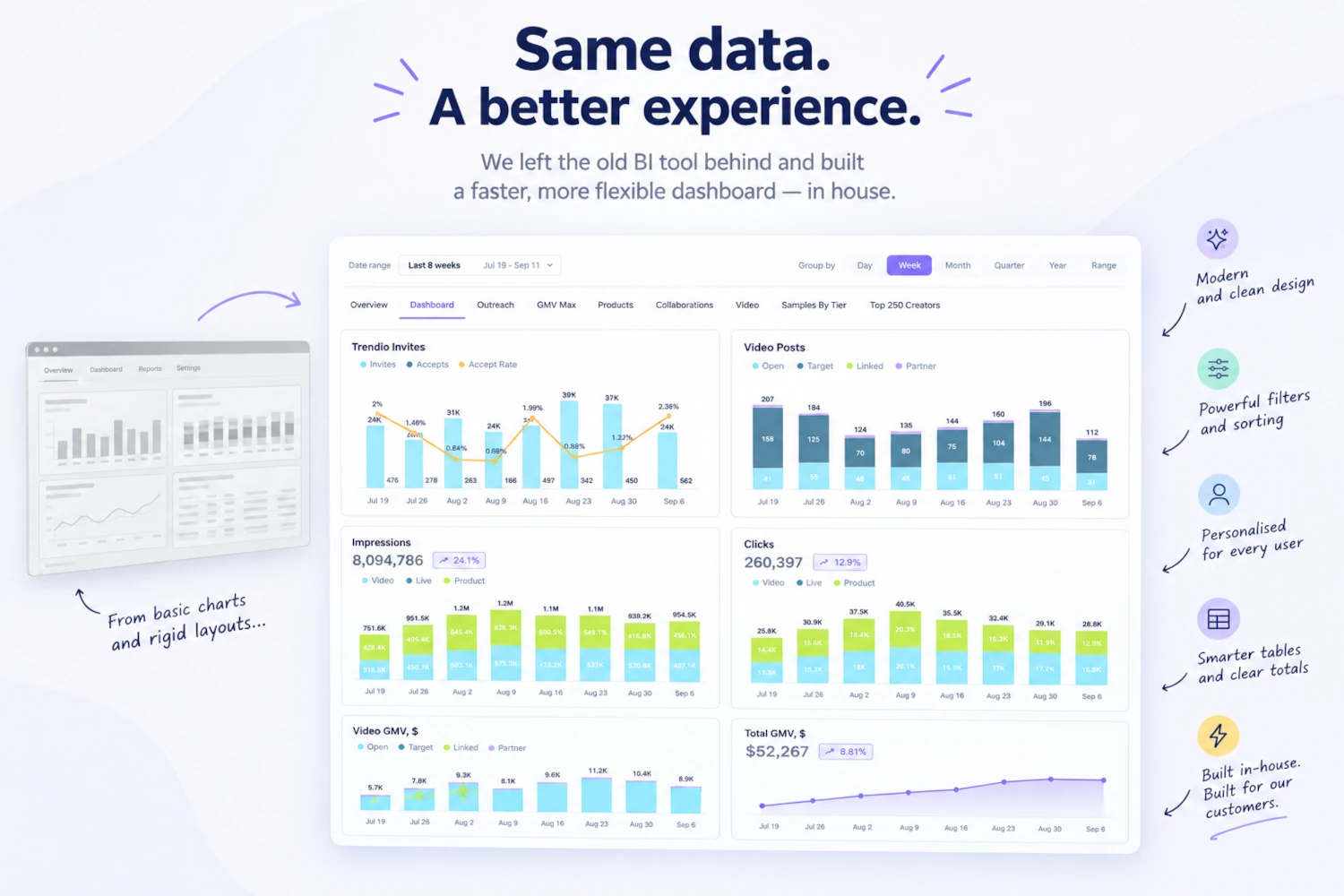
At Trendio we deal with a very large amount of data every single day, and it all comes from our Operations. We create hundreds of thousands of invitations daily, and we refresh millions of rows of information about brands, products, creators and videos.
For a long time, the tool we used to show that data was Amazon QuickSight. There are many Business Intelligence tools: Power BI from Microsoft, Tableau from Salesforce, Looker from Google.
This is the story of why we moved away from Quicksight, how we did it, why we did not consider any of its competitors and what we would tell anyone sitting where we were a year ago.
The stack we had
All our data infrastructure and processes were designed around AWS services from the start.
We used Redshift, connected to a read-only copy of our database, to consolidate data through daily stored procedures. Every day an AWS Glue job triggered those procedures at a fixed time, while our client base was still asleep. The procedures joined data from several large tables into scorecards — pre-aggregated, denormalised, and highly efficient to query from a BI (Business Intelligence) tool. The output was written into our data warehouse database.
And of course, the final link of this chain was AWS Quicksight that allowed us to crunch and display that information in a user friendly way.
In QuickSight, we used their three-layer approach:
- Datasets (data gathering and crunching)
- Analytics (data filtering and representation)
- Dashboards (reports publishing)
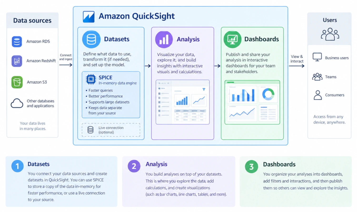
We started by building Datasets, which are conglomerates of different tables, entities that group the data that is needed to be displayed graphically. When you serve large volumes of data and you want to do it swiftly, saving the user a long waiting time, you need to use optimized and highly efficient data structures. In AWS, we relied on SPICE, QuickSight's in-memory data store. Instead of querying the original database every time someone opened a Dashboard, QuickSight imported the data into SPICE and ran analytics directly against it. Using SPICE also allowed us to refresh all datasets automatically every weekday early in the night, plus twice over the weekend.
On top of those Datasets we built Quicksight Analysis organised in tabs that gathered all sorts of tables, bar charts, line charts and donuts. Analysis are where you build and explore the report.
Finally, those Analysis were published as Dashboards, the final user-facing version of that report. The beauty of it was that those Dashboards were embedded in our Selfcare.
In terms of costs, the AWS pricing was indexed on two things: the number of users who accessed our Dashboards, and the volume of SPICE data.
What QuickSight got right
It would be unfair to write this as a takedown. A few things in QuickSight were genuinely good, and we missed them on day one of the migration:
- Filtering, sorting, calculating fields and generating graphs. The authoring experience here was excellent. Adding a calculated field took a minute, not a sprint. Anyone could do it in the company, from an engineer to an account manager.
- Managed refresh. SPICE handled caching and scheduling for us. Nobody on the team owned it, because it just ran.
- Security. AWS offered Row Level Security. It worked, it was well documented, and it meant we never had to think about multi-tenant data isolation at the presentation layer.
- Embedding the Dashboards. This bit and the RLS required some tech skills but were well covered by AWS documentation and were quick to integrate.
If your dashboards are internal, if your users tolerate a generic look, and if one version of each dashboard is enough, QuickSight is a great deal.
What kept us awake at night
Unfortunately, unlike the rest of our tech processes where CI/CD and repos are fundamental blocks and we take them for granted, in this area, however critical it was, we had no backups, no deployments, no versioning. Stored procedures were no repoed, Quicksight analysis had no efficient tracking or history, scripting for editing did not exist, ownership and permissions were difficult to manage. All our processes around data representation, which was extremely critical to us, were highly risky and prone to errors.
Where it started to hurt
The UI had not aged well. Tables and charts looked basic and grey. The layout was constrained by the tiled design model. A few months after we had implemented it, AWS shipped free-form layouts, but by then migrating was too much effort for the return.
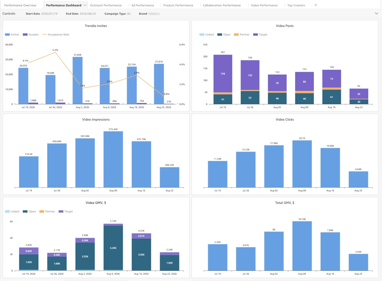
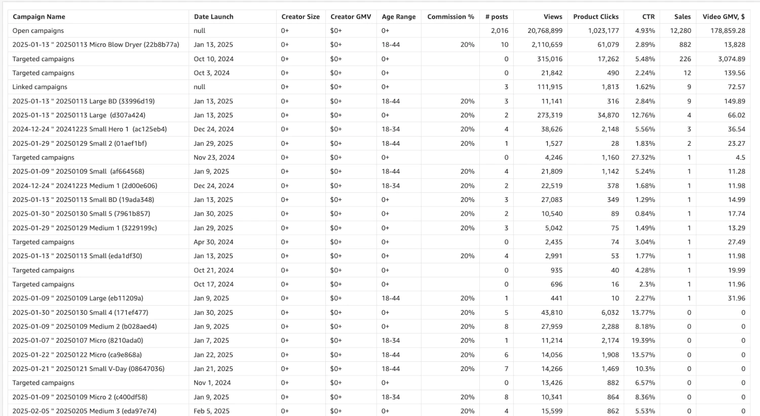
Users could not make the dashboard theirs. No hiding columns. No preferences kept between sessions. Total rows at the bottom of a table came out messy, because every field was displayed whether it made sense to total it or not.
And then, we started having to keep too many versions of the Dashboards. It all started with a basic client requirement: the First Day of the Week. This was the feature customers asked for consistently. Some of them needed their reports to start on Sunday, some on Monday, some on Saturday. In QuickSight, supporting that meant maintaining four different versions of every dashboard. Every change to the data or the layout had to be replicated four times.
And then, we needed to hide some tabs based on customers' plans. It was not truly possible either, so that meant more versions again: with the tab, and without it. The number of versions we had to maintain grew fast (to 8), and the number of mistakes grew with it. We were spending our time on replication instead of on the product.
The real trigger
Here is the part that finally decided it for us.
We learnt that our Account Managers felt better sharing reports to customers that were built on that data but completely revamped in terms of design. We had stopped using our selfcare to share Dashboards in our meetings. We used PowerPoint presentations, built from data we exported out of QuickSight as CSV. We were paying for a BI tool and still doing the last mile by hand.
Moreover, our Business team wanted features that QuickSight could not give: period-over-period columns, summary rows with some cells deliberately left empty, customer-configurable views. Every one of those requests came back with the same answer, and it was no.
At that point the question stopped being "can we make QuickSight work" and became "can we build a better solution?".
The plan: two phases
We deliberately split the migration in two, and we did not start the second phase until the first was done.
Phase 1 — re-engineer the data so we could access it in the fastest and lightest way possible. AWS did a great job here and we could not afford to lose performance.
Phase 2 — design the UX/UI we actually wanted, and serve it directly inside our Selfcare so customers reach it without an export step.
Keeping these separate mattered more than we expected. Phase 1 had a clear, testable finish line — same numbers, served faster — and it meant that when we started building screens, the data underneath them was no longer moving.
Phase 1: the data
We redesigned the architecture around very specific scorecards, fed daily by consolidation processes running in our own backend.
That single change freed us from four things at once: the read-only Redshift tables, the stored procedures, the Glue and the QuickSight datasets (SPICE costs included). The consolidation logic moved into code we version, review and test like the rest of our codebase, instead of living in stored procedures that only one or two people could safely touch.
It took us months to re-engineer our data and have the infrastructure ready for migration.
Phase 2: the interface
For the rebuild we used our Agentic Software Factory. If you're interested, read this article, Inside Trendio's Agentic Software Factory, that explains the agentic coding setup our team runs on.
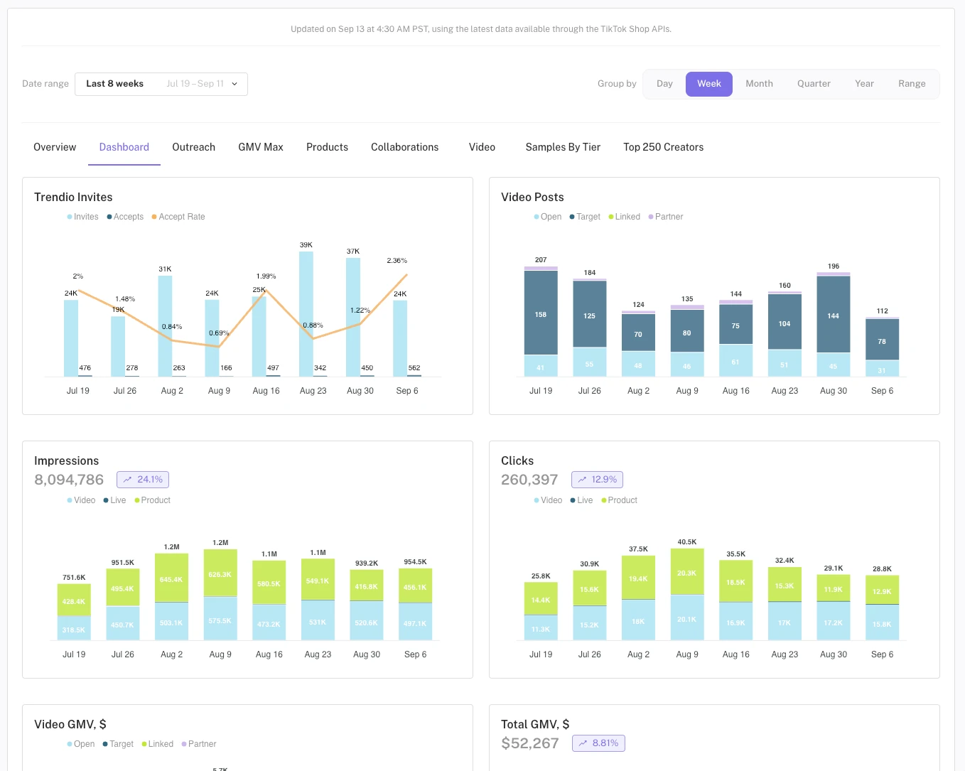
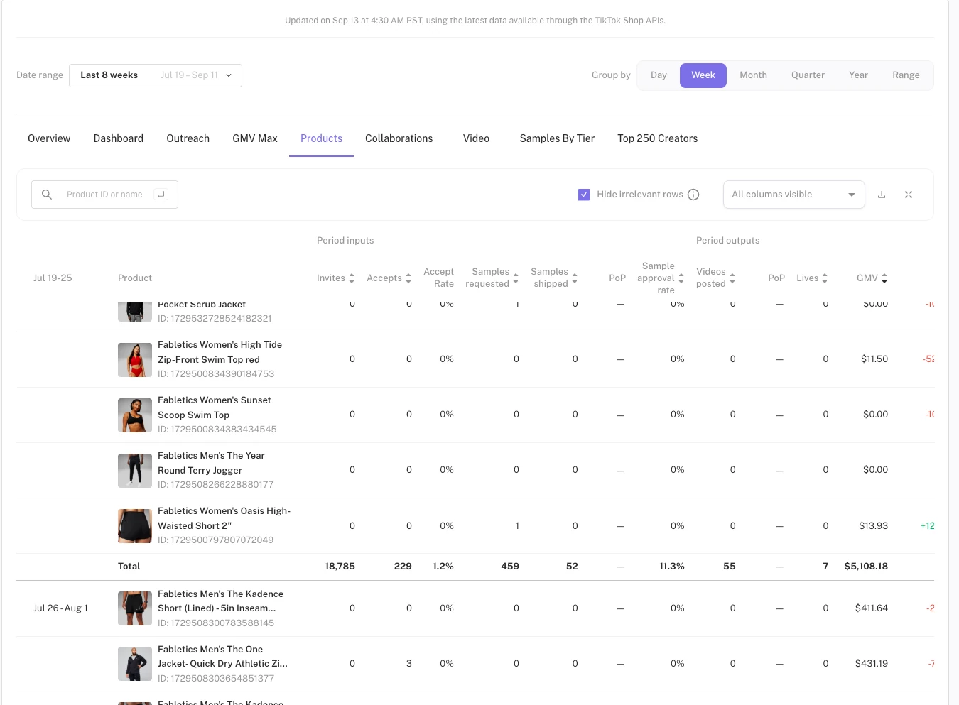
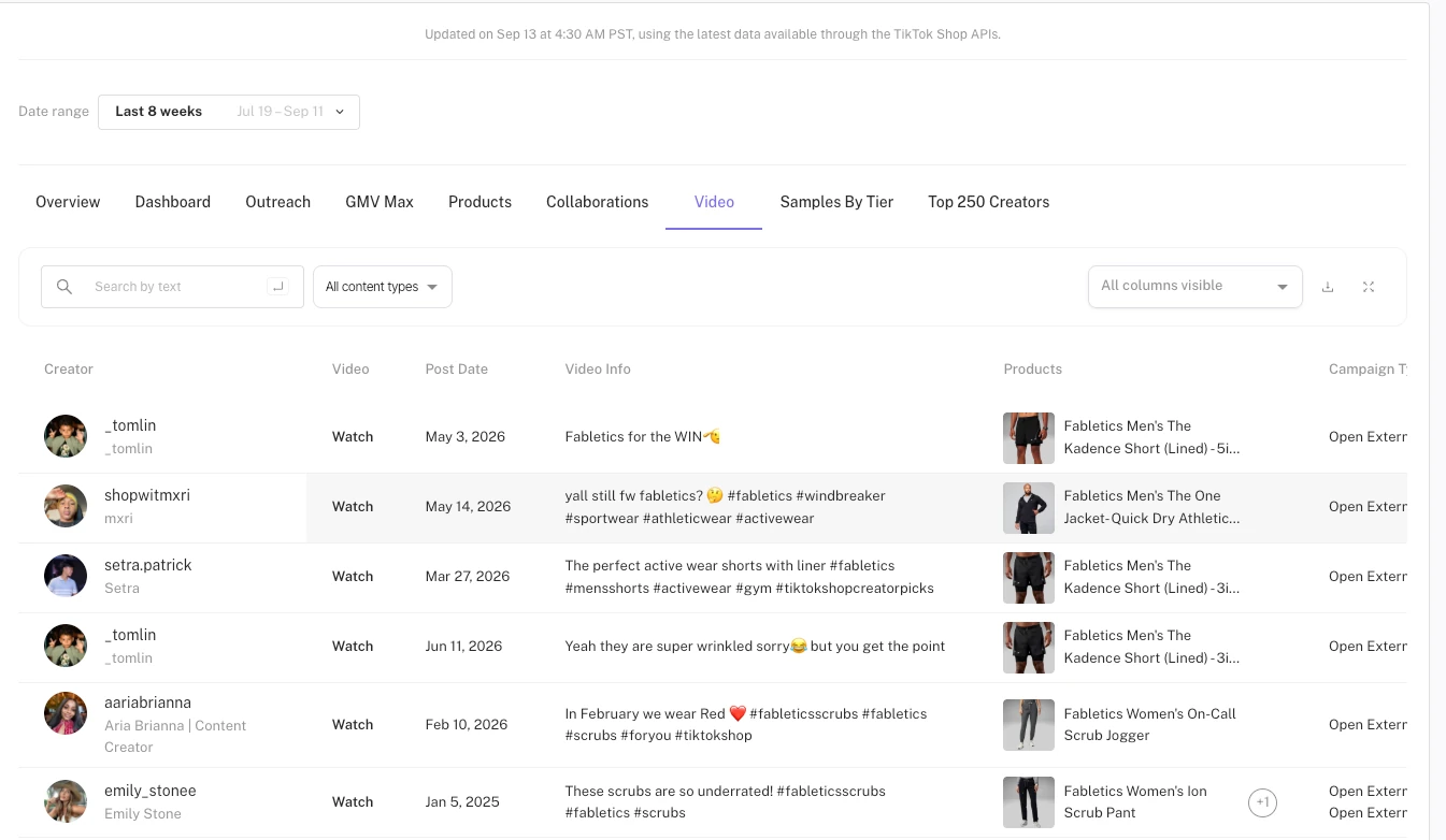
We rebuilt all the dashboards as tabs, with the functionality we had been expecting and designing for two years:
- Natural search across fields
- Extensive sorting and group-by options
- Ad hoc filters
- User preferences stored, and session preferences kept in memory
- Tables with some intelligence built in
That last point deserves an example, because it sounds small and it is not. You do not need to repeat the date in the first column of every row when several rows share the same date. Remove the repetition and suddenly the table reads as indented and structured instead of as a wall of values. Same story with total rows at the end of each period — and even better, ∆ total rows, which show the movement rather than the restatement. Add colour to the right fields and the information becomes readable at a glance.
The cherry on the cake: it took us less than a day to build a Presentation mode that pushes any visual to full screen. In QuickSight, that feature did not exist at any price.
Overall, it took us 2 weeks to have our first basic version of the Dashboards and another 3 weeks to have our fancy final Dashboards.
What we took on by leaving
Being honest about the other side of the ledger:
- We now own Row Level Security ourselves. Getting multi-tenant isolation right in our own app was non-negotiable work.
- We own refresh, caching and uptime. SPICE was somebody else's problem. Now it is ours.
- A new metric used to be authored in the UI. Now it goes through the backlog like any other code change. We traded capacity to have anyone authoring for control and consistency — worth it for us, but it is a real trade. However, we did not sacrifice speed. Calculated fields were a two-minute job in BI; creating new views or fields now takes a day. Pretty reasonable.
- The maintenance never ends. A BI tool is a product someone else improves. An in-house dashboard improves only when we invest in it.
In terms of costs, we were spending thousands of dollars on AWS services. We no longer spend that.
Would we do it again?
Yes — but the reason is not the one people expect.
We did not rebuild our Dashboards because QuickSight was expensive, or because it was slow. We rebuilt them because data is our most valuable asset, it made the Dashboard one of our star products, and we could not shape it. The moment your BI tool is a customer-facing surface rather than an internal reporting tool, every limitation in it becomes a limitation in what you can sell.
So the question to ask is not "is this tool good enough for our analysts". It is: who looks at this screen, and is that screen part of what we are selling? If the answer is customers, you will eventually hit the wall we hit — the version explosion, the exports, the features you keep saying no to.
If the answer is your own team, stay on the managed tool. Rebuilding was the right call for us.
About Trendio
Trendio is a video shopping technology provider and agency that works with brands across categories on TikTok Shop, YouTube Shopping and video web embedding. Trendio combines proprietary AI solutions with channel expertise to identify and engage the best affiliate creators for every brand in every channel, manage their entire video creation process, optimize brands' own video posts using video AI, manage paid ads for maximum returns and deliver best-in-class tracking. For more information, visit www.trendio.ai.
About the Author(s)
David Olmos is the Co-Founder and CTO of Trendio. A seasoned entrepreneur, David has founded and held key roles in multiple tech startups in e-commerce, social networks and mobile apps. He holds an MBA from INSEAD and a degree in Telecommunications Engineering from the Universidad Politécnica de Madrid.